



What a label actually has to survive
Somebody picks up the bottle because of the label. Then they taste it.
That order is the entire argument for taking wine label design seriously, and it gets resisted by exactly the people who should hear it, because a winemaker who has spent four years on a blend does not enjoy being told that the first decision a stranger makes about it takes under three seconds and has nothing to do with the wine.
But it does, and the shelf is where it happens. A label is the only piece of marketing a winery owns that a customer holds in their hand at the moment of the decision.
A wine label lives in four places and most designs are only checked in one of them.
It lives on a shelf, at eye level or below, beside forty competitors, under fluorescent light, at a distance of about four feet. It lives in a hand, at reading distance, where the back label has to earn a second paragraph of attention. It lives on a screen, at 400 pixels wide, in a shop listing or a club email where the foil and the emboss are worth nothing. And it lives in a regulatory file, where the Alcohol and Tobacco Tax and Trade Bureau either approves it or does not.
The screen one is newer than the other three and it is the one most often ignored. A label that depends on foil, emboss or a fine metallic rule is a label that goes flat in a shop listing and flatter in a club email, where it renders at a few hundred pixels beside eleven others in a grid. Everything that survives that treatment survives because of shape, contrast and the silhouette of the type, which are the same three things that carry it at four feet on a shelf. It is a useful coincidence and we design against both at once.
Designers who only check the second one produce labels that are lovely in the studio and invisible in a store. Designers who only check the first produce labels that shout. The job is all four at once, and the constraint that decides most of it is the one nobody enjoys: the mandatory type.
The regulatory part, which is not optional
Federal rules require a set of statements on every bottle sold in the United States, and they take up real estate whether or not the design accounted for them.
The brand name, the class or type of wine, the alcohol content, the net contents, the name and address of the bottler, the sulfite declaration and the Government Warning all have to appear, and the warning has a minimum type size that scales with container size. An appellation claim brings its own rules about what percentage of the fruit has to come from where. None of this is difficult; it is simply non-negotiable, and it has to be designed in rather than squeezed in at the end.
We build the mandatory block first and design around it. That sounds backwards and it is the reason our labels come back from the TTB approved on the first submission more often than not.
Front label, back label, and the part people skip
The front label has one job, which is to be recognized at four feet and remembered at forty. That is mostly a typography problem and a contrast problem, and it is almost never a problem of adding more.
The back label is where wineries lose the sale they already made. Somebody has picked up the bottle. They have turned it over. They are giving you the only paragraph of undivided attention a stranger will ever give your winery, and most back labels spend it on a paragraph about the soil that reads like it was written for a competition.
Tell them what it tastes like and what to eat with it. Say the thing only your winery can say. Then stop, because the person holding it is standing in an aisle.
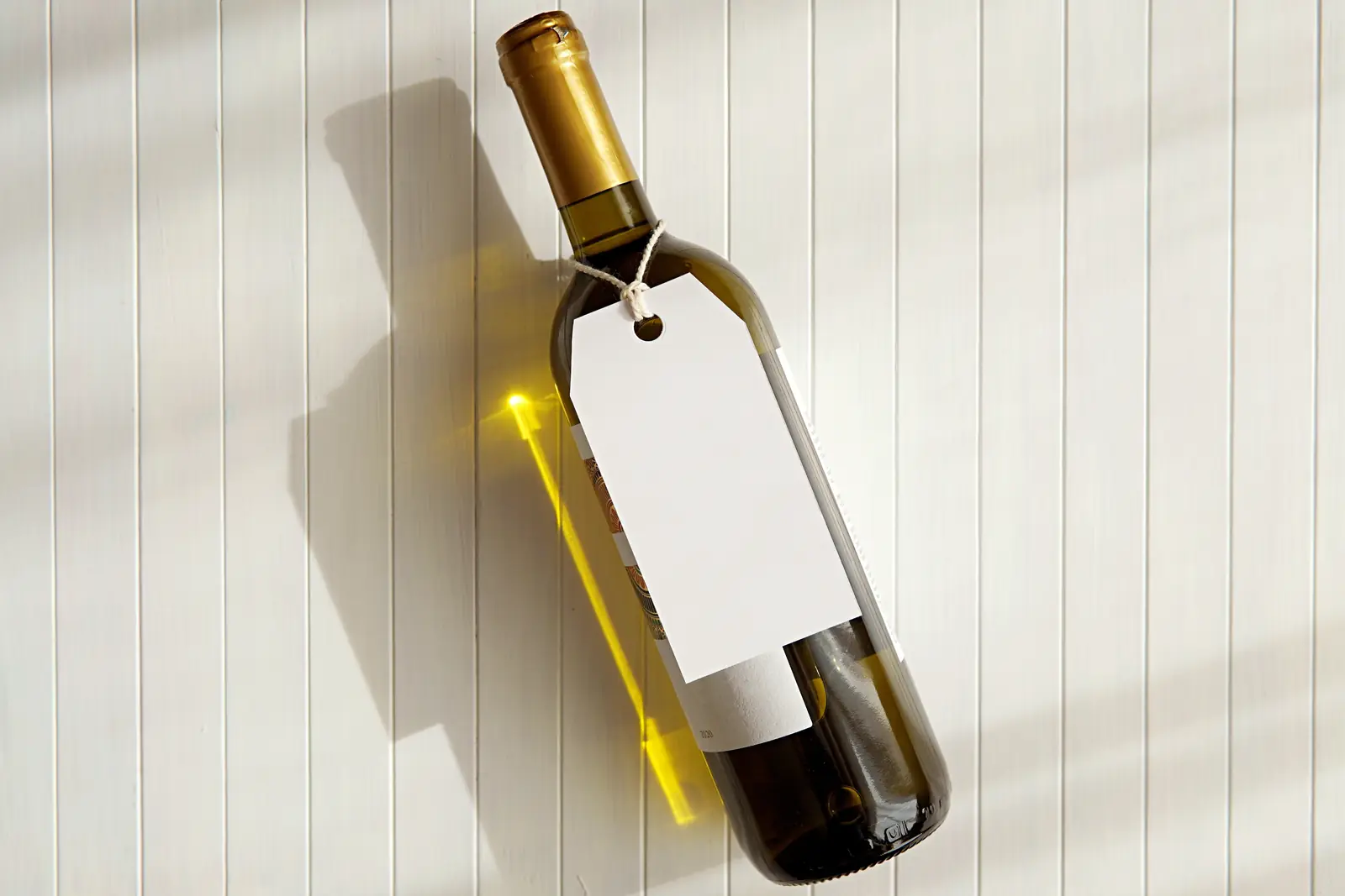
Working as a wine label designer, and what that means for print
A label design that has never been on press is a picture of a label.
Paper stock changes the color. Uncoated stock drinks ink and drops saturation, foil needs trapping decisions made before the file leaves, and an emboss that looks crisp on screen can fill in on a textured stock. The printer is a collaborator, not a vendor you throw a PDF at, and we would rather talk to yours in week one than discover in week six that they cannot hold a hairline rule.
We deliver print-ready files to your printer’s spec, with bleeds, dielines, spot channels and a proof checklist. If you do not have a printer yet, we will name three and tell you honestly what each one is good at.
Custom wine labels for a range, not a bottle
Most wineries do not need a label. They need a system.
A tier, a reserve, a rosé, a club-only bottling and a second label under a different name have to look like relatives without looking like the same wine. That is a set of decisions about what stays fixed and what varies: usually the type stays, the structure stays, and the color and the illustration carry the difference.
Design one bottle in isolation and the second one breaks it. Design the system first and the fourth bottle takes an afternoon.
The club bottling is where this gets tested, because a club-only wine has to feel like a reward without looking like a different winery, and allocation lists have the same problem at a higher price. A range that was designed as a system absorbs both without a new decision. A range that was designed one bottle at a time turns every addition into an argument about whether the new label is too far from the old one, which is an argument nobody wins and everybody has.
The part where the label meets the website
This is the reason a design studio that also builds winery sites is a different proposition from a label shop.
The label sets the type and the palette that the shop page, the club email and the shelf talker all inherit. When those get decided by different people a year apart, the winery ends up with a label that looks like one company and a website that looks like another, which is a problem customers notice without being able to name. If the site is coming too, winery website design and the label get built against the same decisions, and the whole system is covered on the wine marketing hub above this page.
What moves a label from the low end to the high end
The spread is mostly illustration. A type-led label with a strong structure sits at the low end and can be genuinely beautiful. A label carrying original illustration or hand lettering sits at the high end, because somebody has to draw it and that somebody should be paid. Print management, TTB submission support and dieline work are included rather than billed as extras.
How long it takes
Four to eight weeks from the first conversation to print-ready files.
Two rounds of revision are built into that, and the schedule assumes the winery can make a decision when the concepts land. The thing that stretches a label project is almost never the design. It is a family with four opinions and no tiebreaker, which is worth sorting out before the first concept rather than after the third.
Common questions
Do you handle TTB approval?
We prepare the label to meet the requirements and support the submission, including the mandatory block, type sizes and appellation language. The filing itself is yours or your compliance provider’s, because the applicant has to be the bottler.
Can you work with our existing printer?
Yes, and we prefer it. A printer who already knows your stock and your press is worth more to the project than any preference we have.
What if we already have a label and just want it refreshed?
That is a real project and often a better one than starting over. Equity in an existing label is worth protecting, and the usual answer is to keep what customers recognize and fix the parts that were never working.
Do we own the artwork?
Yes. You get the working files and the fonts are licensed to you, or we tell you upfront which face requires a license you will need to hold.
How much of this can we decide later?
Less than you would like, because the mandatory block, the stock and the print method all constrain each other and all have to be settled before the first concept is worth drawing. The parts that genuinely can wait are the illustration and the vintage-to-vintage variation, and we will tell you which bucket a decision is in when you ask.